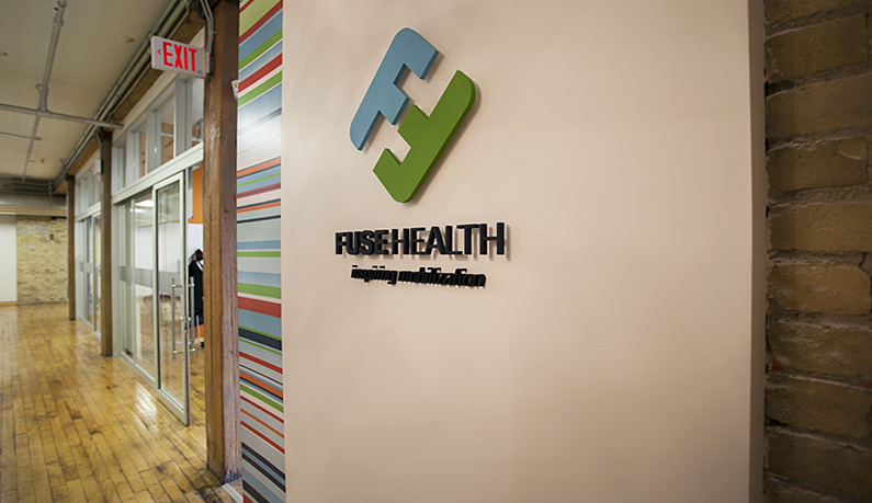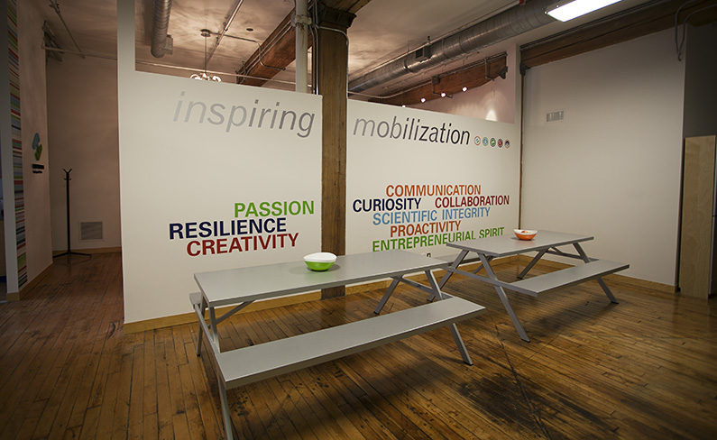
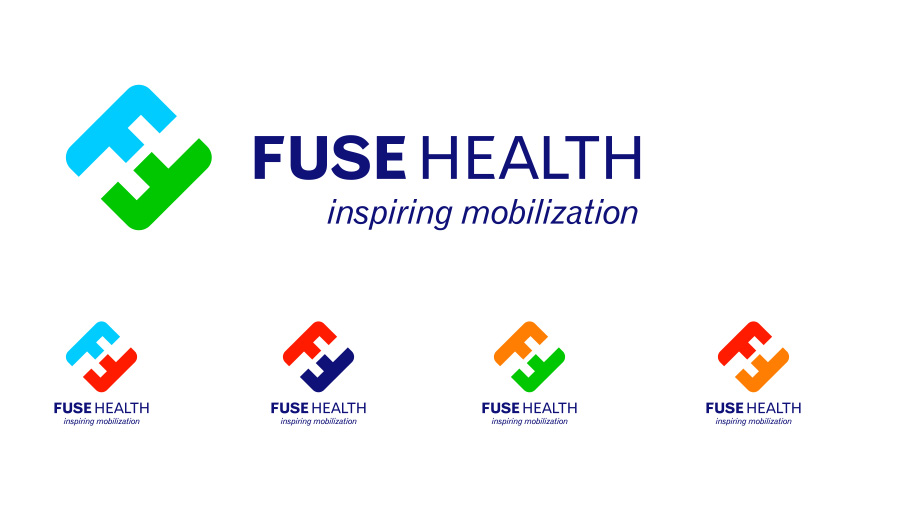
Segovia Advertising & Design Inc. rebranded Fuse Health, a Canadian health communications agency. Collaborating with GNR8R Marketing which led the strategic insight for Fuse Health, Segovia Inc. looked at the existing brandmark situation. FH’s brandmark, tagline and brand identity evolved, keeping close connections to what made sense, and abandoning what was unnecessary. Colour, typography and the icon were all fine-tuned and further explored. A new visual identity and art direction was born from several strategic sessions and outcomes.
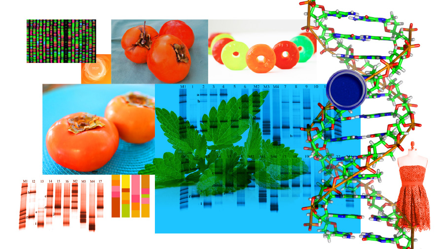

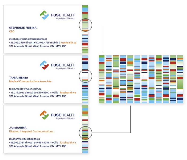
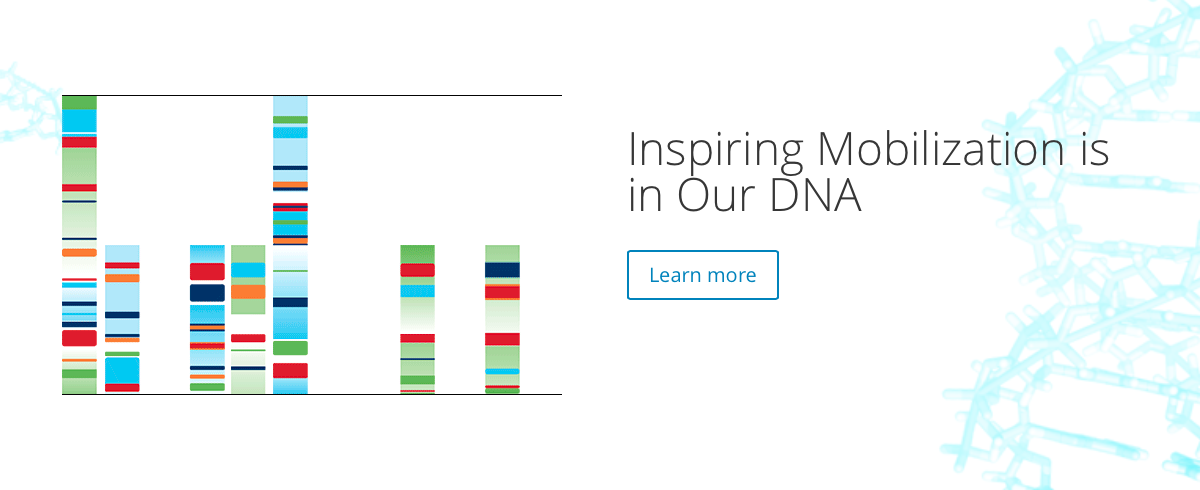
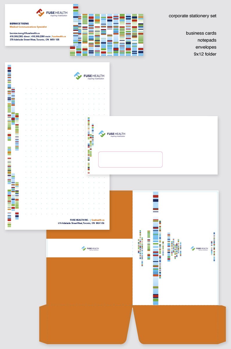
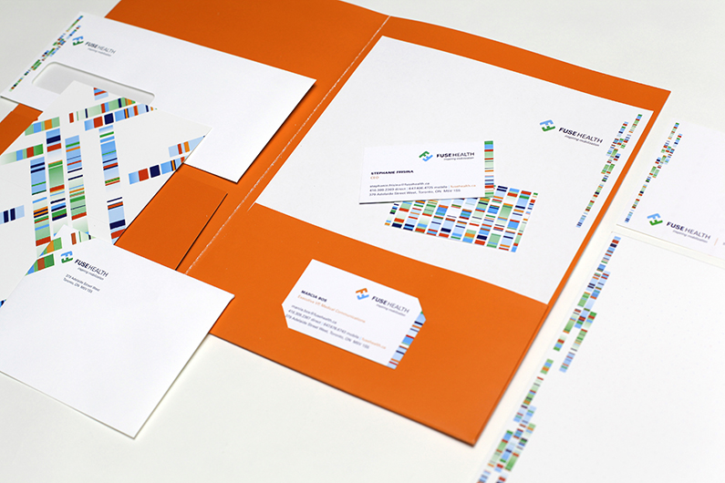
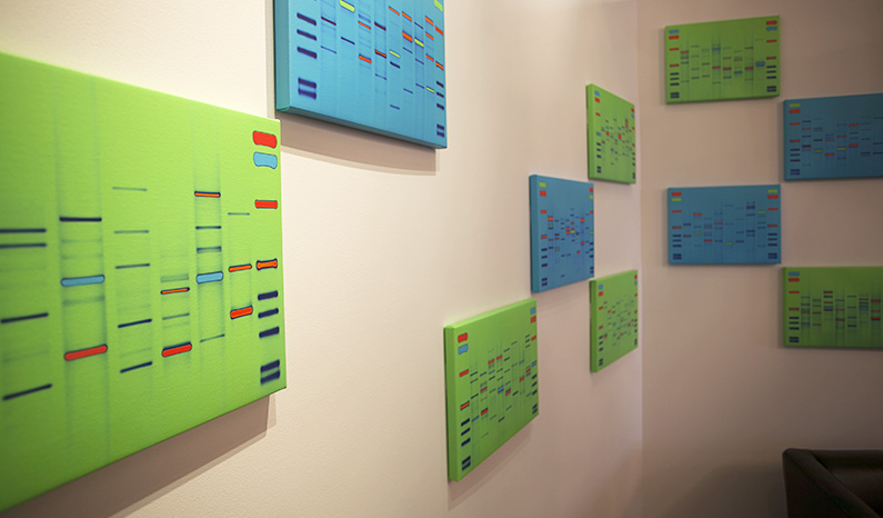
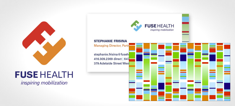
The most unique aspect of the Brandmark concept was the notion of unique identity. Each employee went through the physical process of getting their own dna sample and test done. After we received the gel electrophoresis images form the lab – we created a unique vector art “DNA” print for very individual. When you look at the employees business card design, you are looking at a design that is unique to them only – a dna fingerprint. These designs are authentic and highly personalized. The back collage of the card is a collect of all staff at FuseHealth – therefore it becomes a true representation of their staff.