
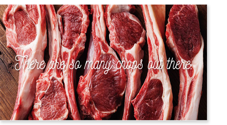
A brand identity was developed for an up-market Halal Butchery. Its goal is to be positioned as a leading ethnic grocer that would attract both Muslim and Non-Muslim alike. The new brand would fill a large hole in the market and offer greater visibility into the middle-eastern segment of international cuisine.
Below are some of the conceptual designs of the project. When designing Brand Signatures/Logos – some of the things that inform the design is some connection or tie to the core business or benefit. Visually, there is a tie to the broader context of what the brand and promises to do.
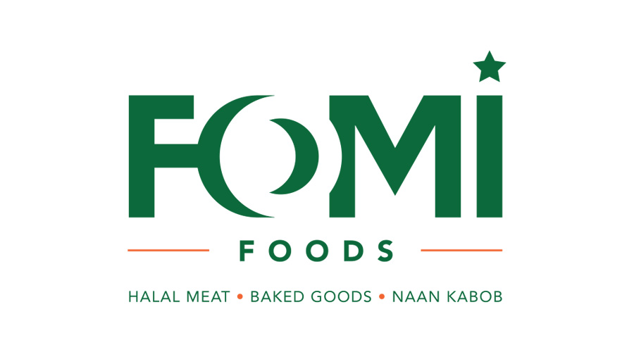
Concept 1: Customized typography was created specifically for this name. The negative space creates the “o” adding a 3-dimensionality. There are also 2 key symbols that refer to the islamic faith: the crescent and star. As well, the use of the green ties it to muslim cultural references.
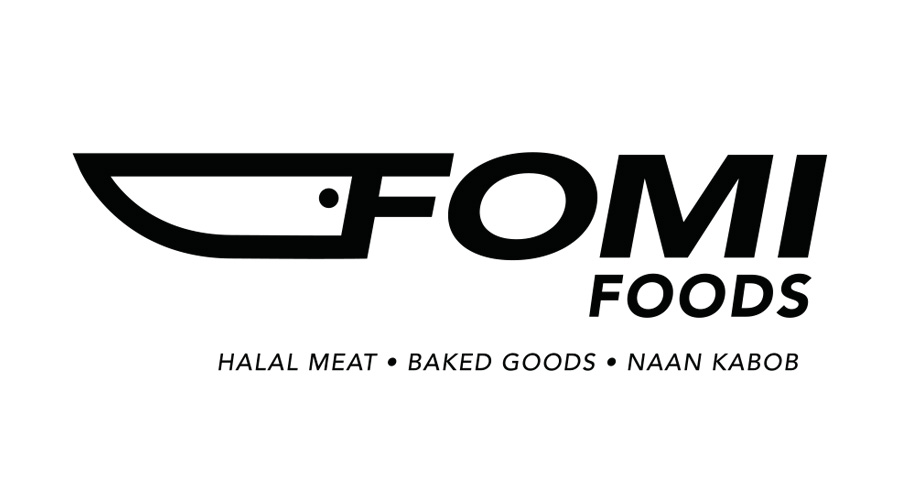
Concept 2: Highly customized and ownable, the “F” forms a handle of a carving knife. Pure, bold, modern and highly recognizable. The design has a sense of motion and confidence. It is universal and focuses on Fomi’s core competency: meat and butchering.
Concept 3: This design utilizes icons of the cleaver and meat configured in a symmetrical and smart configuration. This is a highly purified and customized brand mark – you wont find it anywhere. Pure, modern, clean and bold. Highly visible and ownable. Feels contemporary yet approachable, maybe even “European or international feeling”.
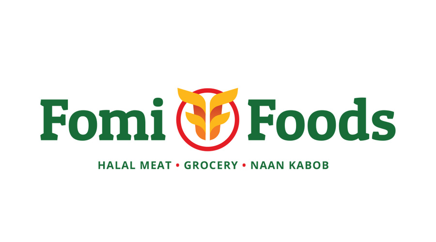
Concept 4: This brand mark idea comes from a reference to the history of early Mesopotamian agriculture and the “bread basket” (earliest areas of civilization). The wheat sheaf is also connected to grain fed meats. It is a universal metaphor for food, and also has two hidden “F”s within the design.