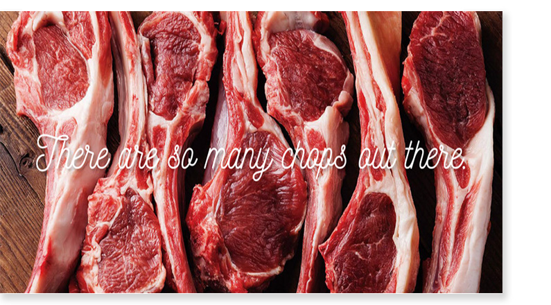
A brand identity was developed for an up-market Halal Butchery. Its goal is to be positioned as a leading ethnic grocer that would attract both Muslim and Non-Muslim alike. The new brand would fill a large hole in the market and offer greater visibility into the...
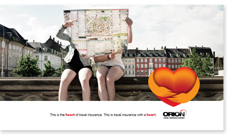
Segovia A & D developed ideas for the Agency Barrett and Welsh. The brief was for Orion, a Canadian travel Insurance provider. The need was for a mnemonic or graphic element that could live lateral to the brand mark. This visual component would be used in ads,...
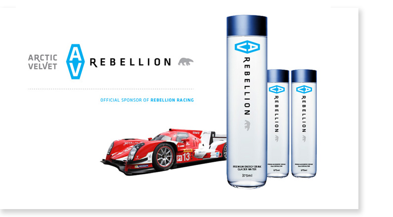
Here are some designs for a logotype brand identity for Arctic Velvet Rebellion, a glacier water/spirits concept. Segovia Advertising & Design Inc. worked with GNR8R Marketing Group to develop a concept and direction for a European client.
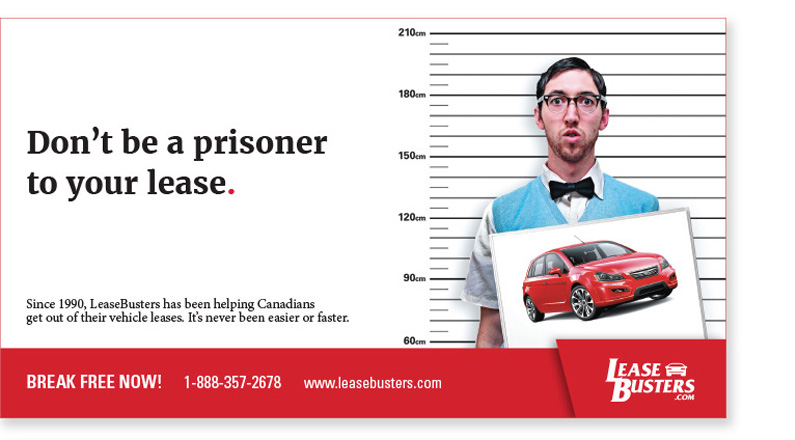
Below are ads that were developed for Leasebusters.ca, a Canadian company that helps you break out of your car lease. The ideas are light and poke fun at the basic emotion of feeling trapped in a relationship. Ads were then rolled out in multiple newspaper sizes and...
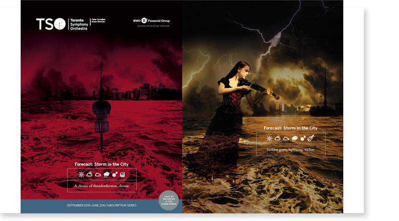
Below are four of the main campaign concepts developed and presented to TSO for their main subscription magazine. This is a 42 page printed piece mailed out to the primary demographic of the TSO to sell ticket subscriptions and packages. The client’s briefing...
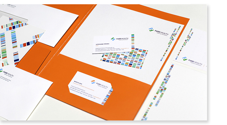
Every now and then, you work with a client that inspires you and truly moves beyond the usual comfort zones. Fuse Health is one such client. One of the leading health marketing agencies based in Toronto, Segovia worked with Fuse Health to rebrand and reinvigorate...
Segovia was commissioned to develop, design and handle full production for the Toronto Symphony’s Annual Subscription magazine. This is TSO’s largest outgoing marketing piece. It is a 42 page full-colour magazine with an 8 page chronological insert....
Branding – That Buzzword is Everywhere. Branding is one of the most important aspects of any business, large or small, retail or B2B. But what exactly does “branding” mean? How does it affect a business like yours? Your brand is your promise to your...
SecCon is an International Security conference held by Cisco Sytems inc. This year SecCon’s theme is “Trusting the Internet of Everything.” IoE is the connection of people, data, process, and things. The IoE is made up of many technology transitions, including the...
A brandmark & key visual were created for Proctor & Gamble, one of the key sponsors of Desifest & Hungama. Desifest is a South Asian music festival in Toronto. The key visual, “Mehndi-Rock” was a combination of two major ideas of the festival: South...
Below is an ad done for the Toronto Professional Firefighters Association. This is in response to Toronto City Council cutting funding which affects fire service in Toronto. This is an example of an “Infographic” driven ad. Visuals and easily read...
Using All Surfaces in Package Design This is an example of a custom designed package. From concept to production, this piece was a custom solution to fulfill a need for all media components to be housed in one package. This vehicle launch kit is totally custom, from...
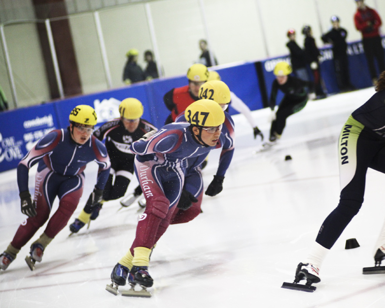
Segovia Advertising & Design has overhauled and redesigned the online presence for The Durham Speed Skating Club. Incorporating fresh design and punchy photography, the new site also introduces a CMS/Blog functionality which pushes the online presence into a much...
Segovia Advertising & Design was commissioned to create 6 videos for the Peter Perry Award Winners in the Township of Whitby. These are awarded from the Whitby Chamber of Commerce to business achievers in the Whitby/Durham region. Below are three of the videos....
Although Roughley Insurance wanted to continue to use its existing logo/brandmark, the company needed to finesse its existing logo and evolve its brand touchpoints in collateral pieces. Key brand pieces that were developed were: Anniversary Icon, Sales Kit, Folder,...
Saltwater Communication was an agency/advertising consultancy out in New Brunswick Canada. The agency name was one that captured an essence of the east coast without feeling too regional or homegrown. Segovia’s concept to capture this name was the fusion of the...
The process of creating a brandmark can be an extensive research based process. When a consumer sees a final logo or brandmark, one doesn’t see the creative journey that brand strategists, creative directors, designer and marketing managers have gone through. It...