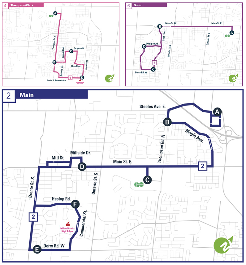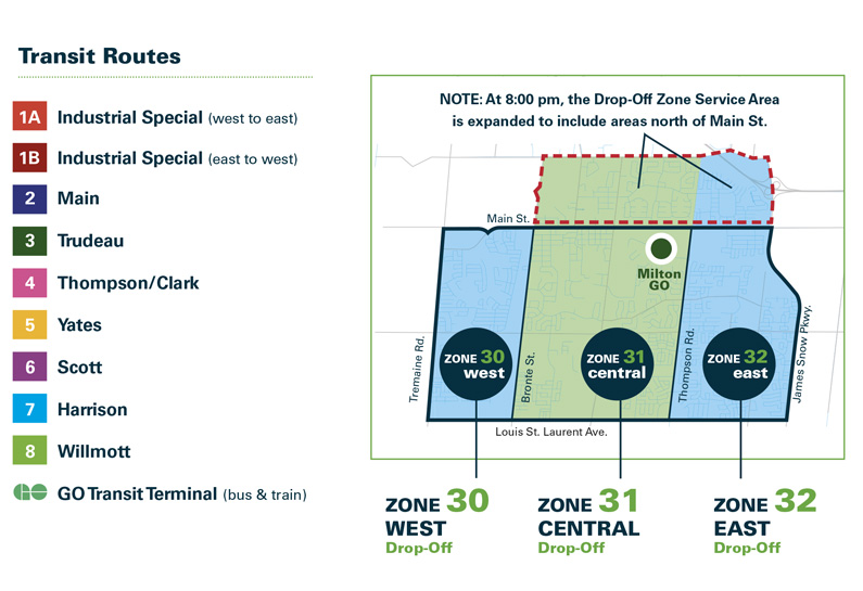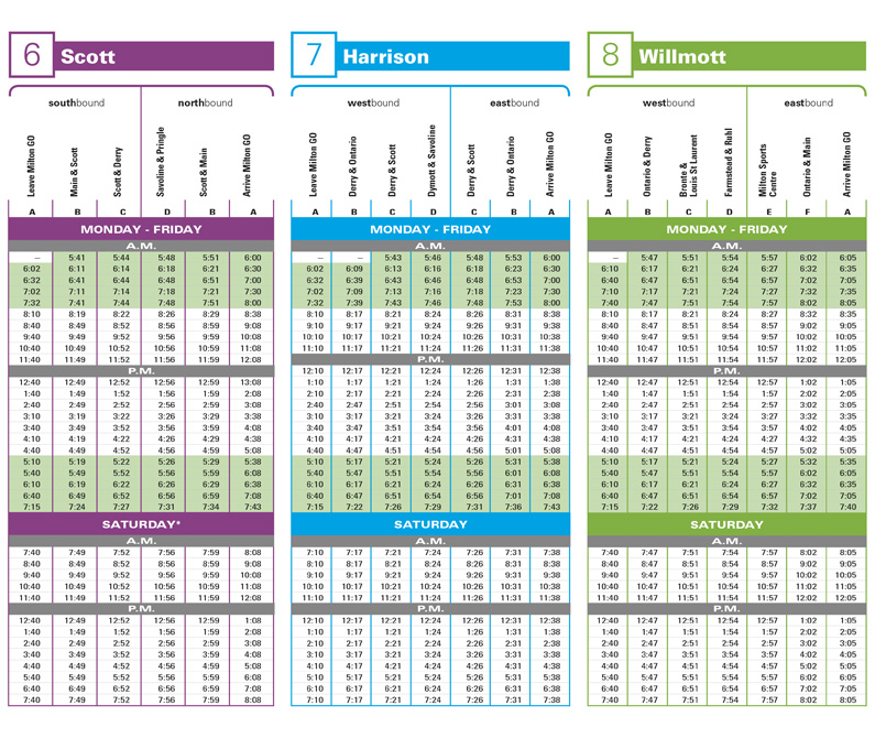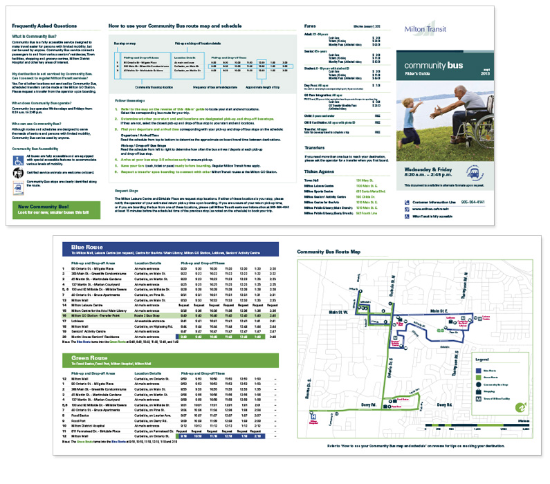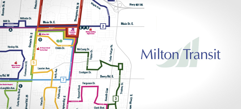
Segovia Advertising & Design Inc. revamped and restructured the information architecture for Milton Transit. This project entailed examining and creating new solutions to Milton Transit’s antiquated information and wayfinding maps used in print and collateral. The challenge was to look at old maps and charts, thoroughly assess what was working and what wasn’t. From there, we redesigned all city maps, route lines, charts, and ultimately how riders would interpret transit information.
The design direction would be focused on cleanliness, legibility, simplification and a refresh with the brand direction. A colour system representing route lines was re-examined and improved. Typography was carefully chosen, icons developed and an overall art direction developed that emphasized clarity.
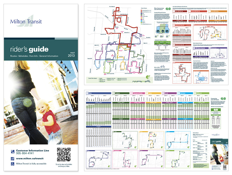
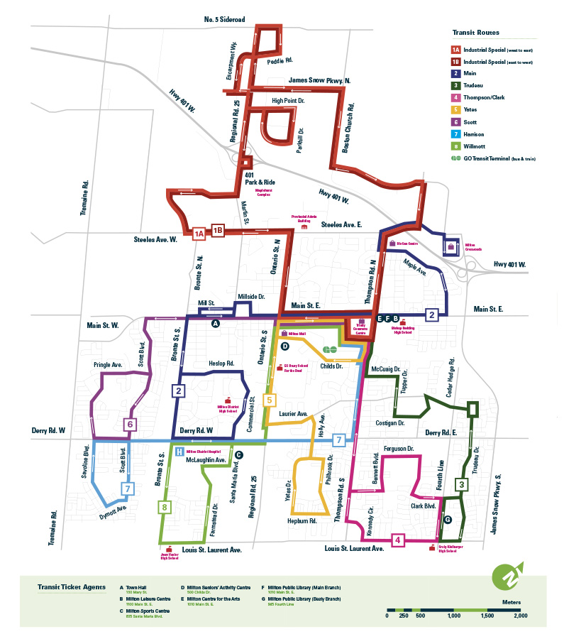
All maps were custom drawn, and all roads & secondary lines built accurately. Lighter greys of all side roads etc. were chosen to simplify and create less distraction. The use of a strong colour palettes insured clarity between transit lines. Colours were selected to maximize contrast and ensure that no colours could be mistaken for one another.