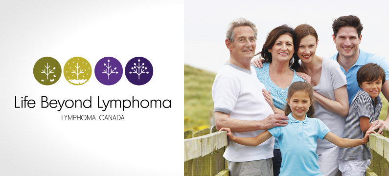
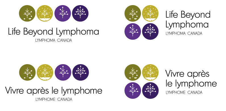
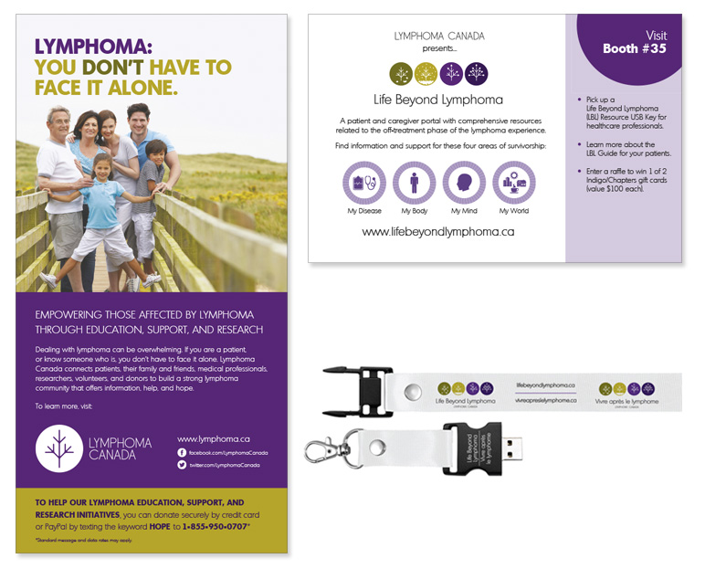
Life Beyond Lymphoma is a sub brand of Lymphoma Canada. Segovia developed and designed the brandmark and brand rollout. The concept of the brandmark was to create an icon system that had conceptual ties to the mother brand (lymphoma Canada) and add another layer of thinking/meaning.
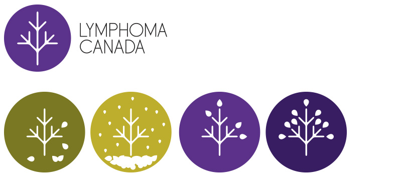
Each icon shares a common tree symbol (stemming form Lymphoma Canada’s main brandmark), yet captures the four seasons in a simplified way utilizing a leaf in different configurations. The seasons are symbolic of the cycles of life, time and nature. The order of the icons represent the journey of the patient: disease, treatment, healing and recovery. The colours make a connection to Lymphoma Canada’s brand standard colour palette.
For the launch of the brand, several strategies were employed to drive traffic to the Life Beyond Lymphoma web portal. Print ads, collateral, tradeshow postcards, banners were created to support and drive traffic.
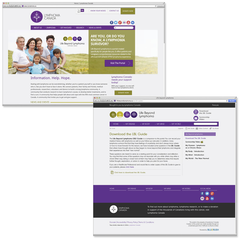
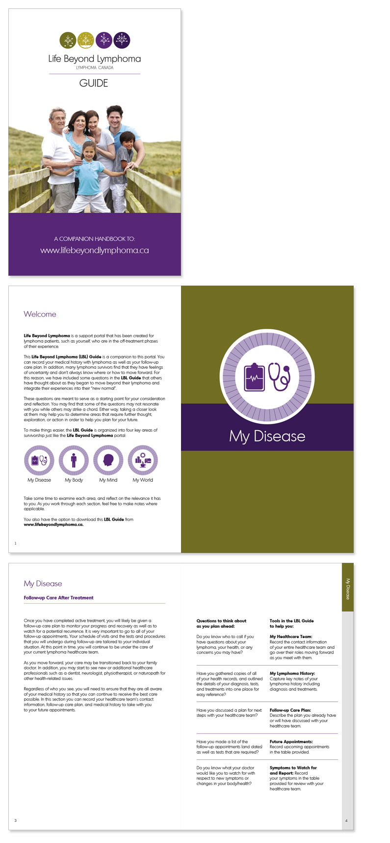
A multipage booklet: The Life Beyond Lymphoma Guide was designed as a workbook for patients. This functions a a great resource holding pertinent information, documenting medicines, treatments and a calendar of symptoms and emotions. It’s a helpful resource for patients, families and medical practitioners. The Web portal was built & developed by BlueRush. Below are some selected spreads of the LBL Guide. First and foremost, the predominant concept of this print piece (apart from extending the brand awareness) is clarity information. Its design is clean, easy to read with plenty of spacing for patient information.