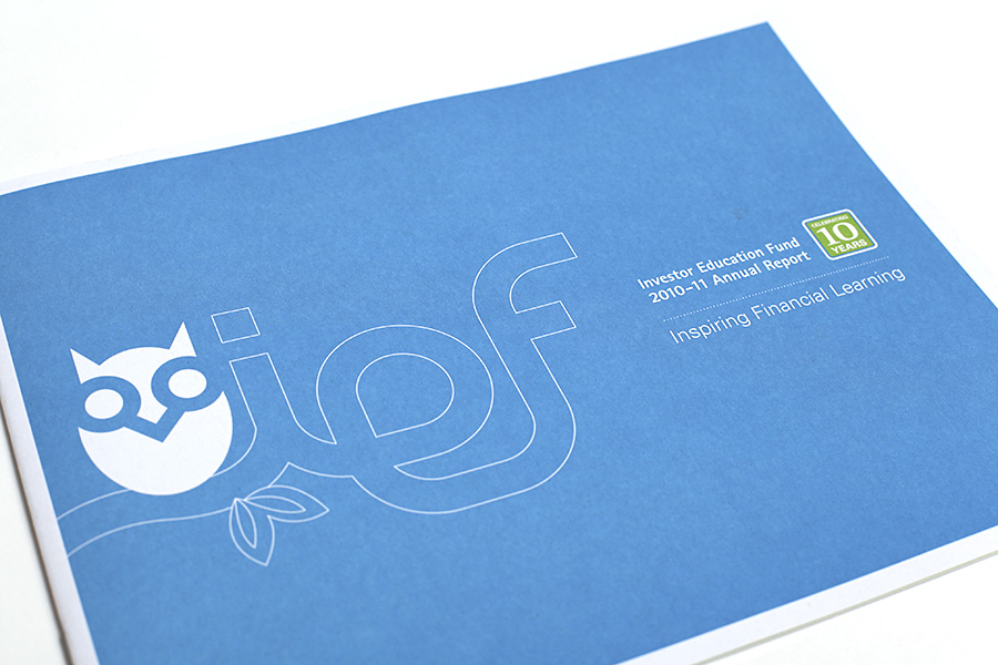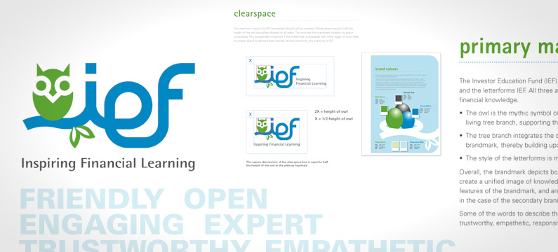
A new brandmark and brand style guide was developed for The Investor Education Fund. A new creative strategy required the organization to shift away from the terms “fund” as these words misdirected the understanding of the brand and organization. Modern typography was chosen, and the icon of the owl became the centrepiece, a metaphor for knowledge, wisdom and wealth.
![]()

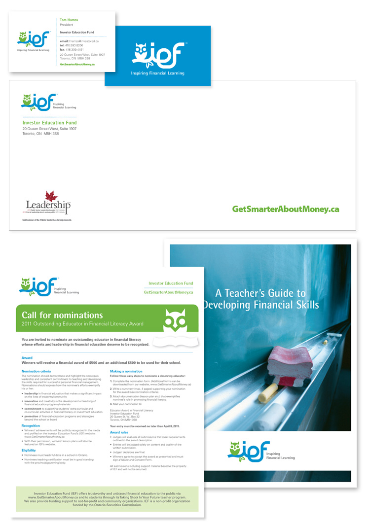
The styleguide introduced a modern, contemporary and friendly brand direction, influencing all collateral pieces and other brand touch points.
Some of the pieces developed for IEF were: booklets & brochures, educational guides, tradeshow signage, Annual Reports and more.