Below are four of the main campaign concepts developed and presented to TSO for their main subscription magazine. This is a 42 page printed piece mailed out to the primary demographic of the TSO to sell ticket subscriptions and packages. The client’s briefing direction was: edgy, contemporary, design driven, feature musicians/artists, excitement. The creative shows how similar themes/strategies can be explored in many different ways, each with their own unique style and idea.
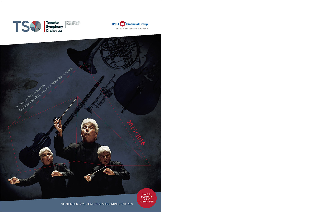
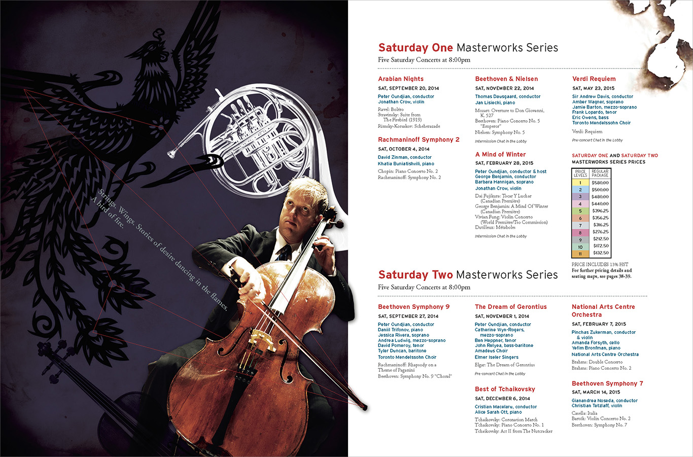
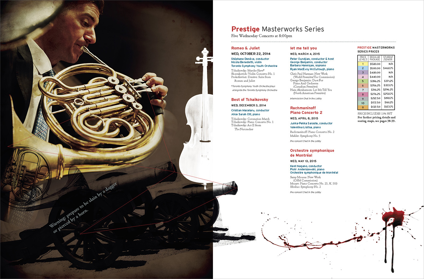
CONCEPT A
This direction revolves around pulling narratives and iconography from the music. Imagery and symbols are pulled from the titles and themes of the musical pieces. Graphic lines connect the artists to the symbols. The stories and emotion burst from the instruments and the design leads the viewer to experience motion and movement of playing.
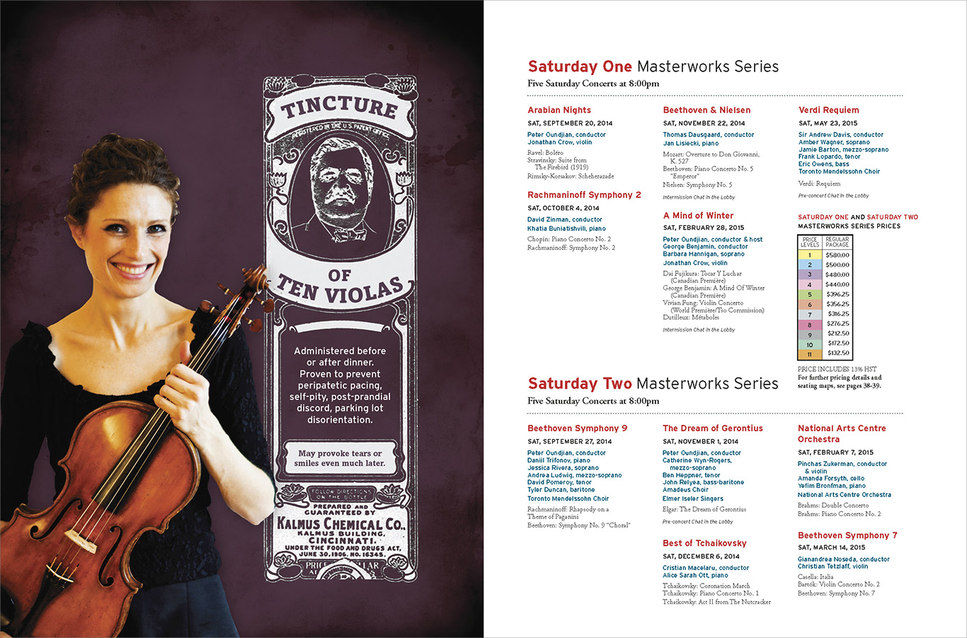
CONCEPT B
Music is remedy. The harmonic vibrations of these classical instruments heal and delight. Writing is unique, poetic and melodic. There is a visual tie to old medicine labels with meticulous typesetting and historical reference.

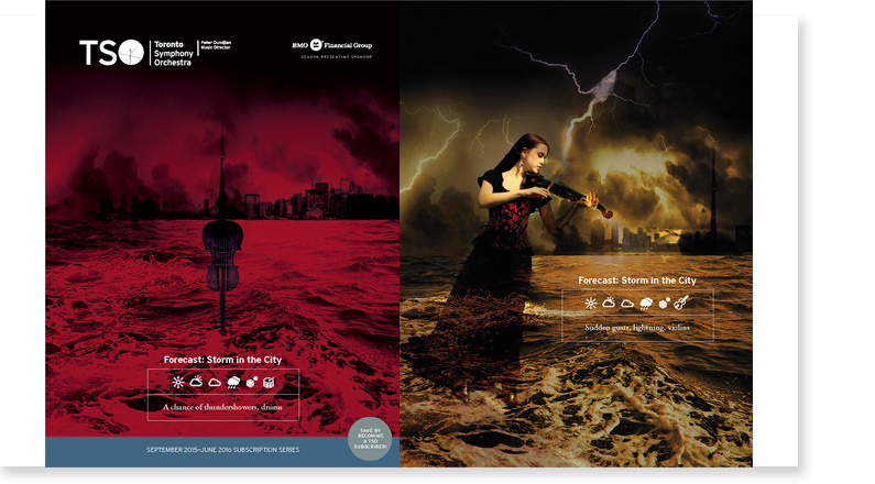
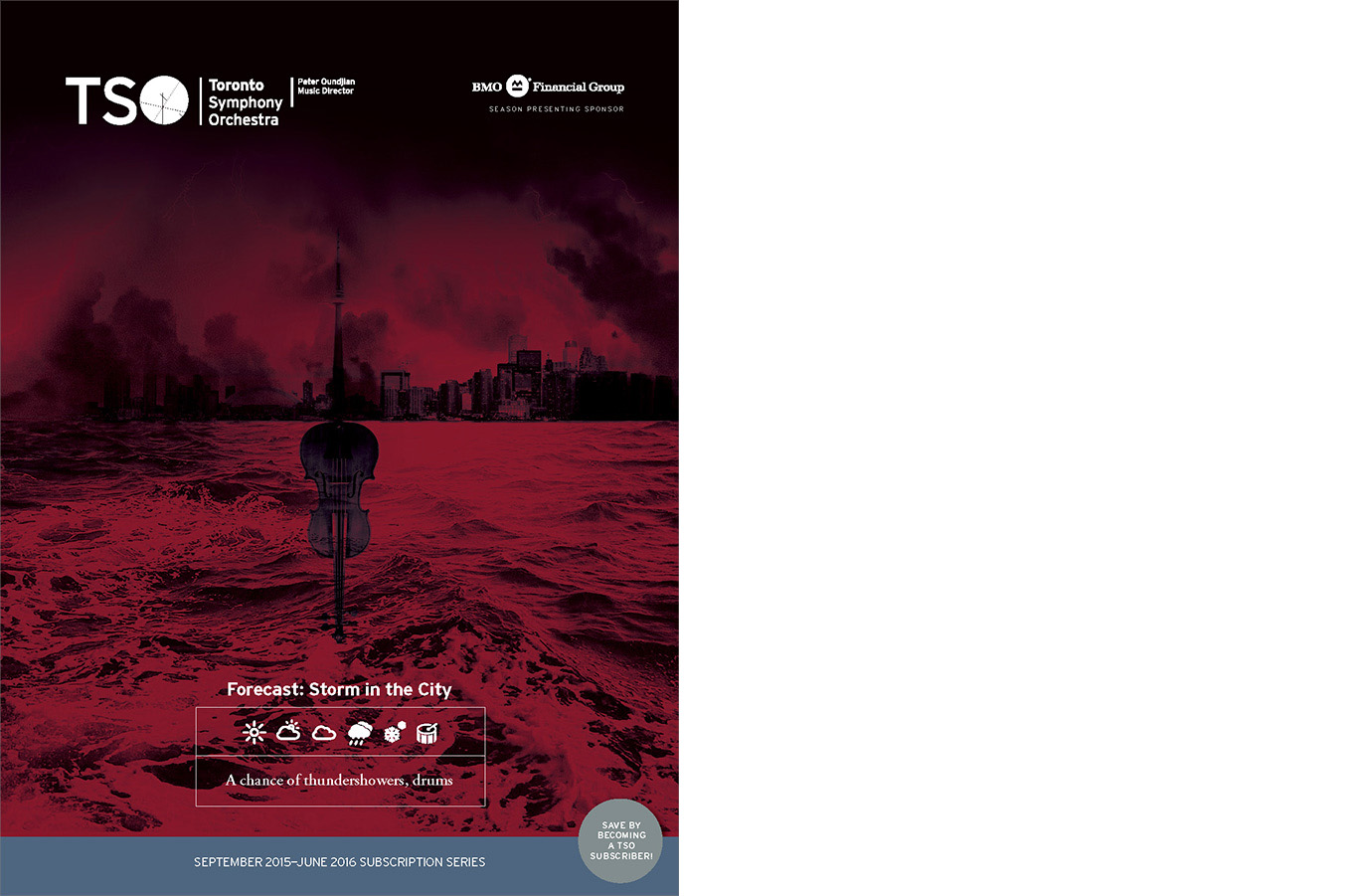
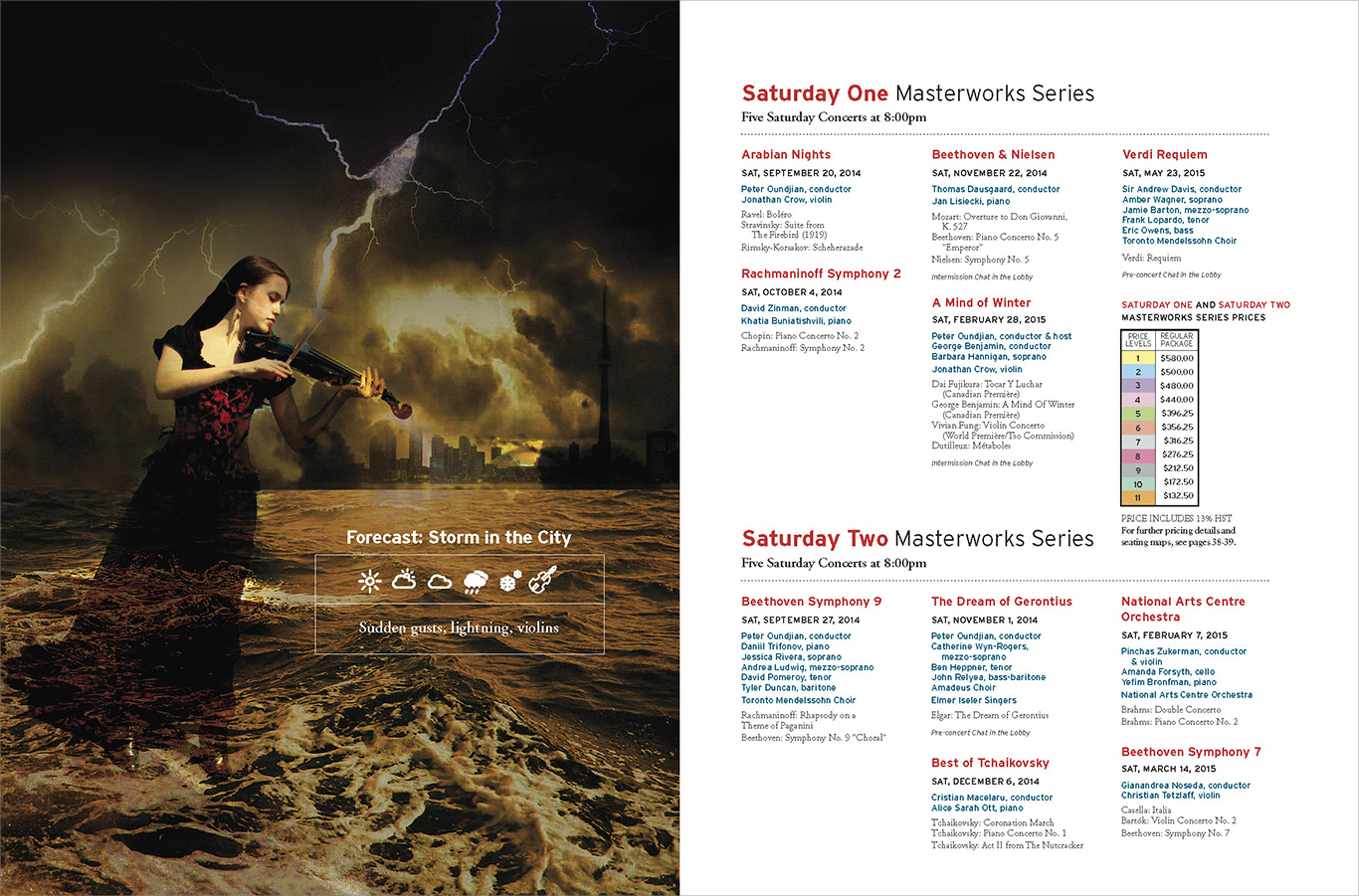
CONCEPT C
The TSO is a storm coming. A storm of emotion, sound and sensory stimulation. Toronto will feel the shaking of thunder, become awash with sound. The energy of the TSO is something that cannot be predicted nor controlled. It is passion and excitement that stirs the musical experience.
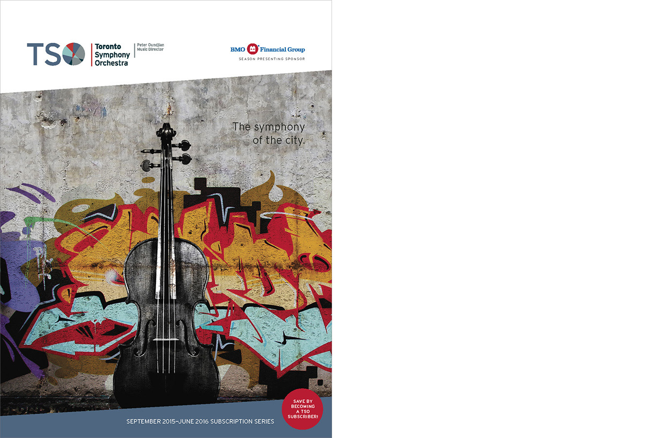
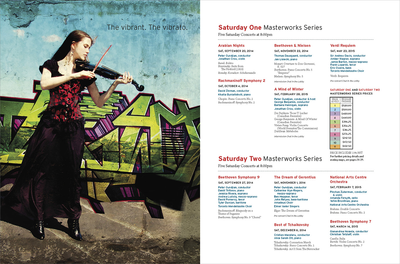
CONCEPT D
This is the orchestra of today. The is a real dichotomy between high art and urban expression. The juxtaposition of classical music, and urban graffiti create a unique and jolting perspective to view the TSO. Landmarks and recognizable graffiti would be shot as backdrops for the artists. There is a direct and raw connection between the artists and Toronto.