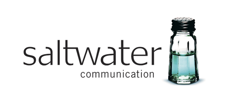
Saltwater Communication was an agency/advertising consultancy out in New Brunswick Canada. The agency name was one that captured an essence of the east coast without feeling too regional or homegrown. Segovia’s concept to capture this name was the fusion of the two core words in the name – salt and water. We chose to create this brand mark fusing a photographic icon with clean typography.
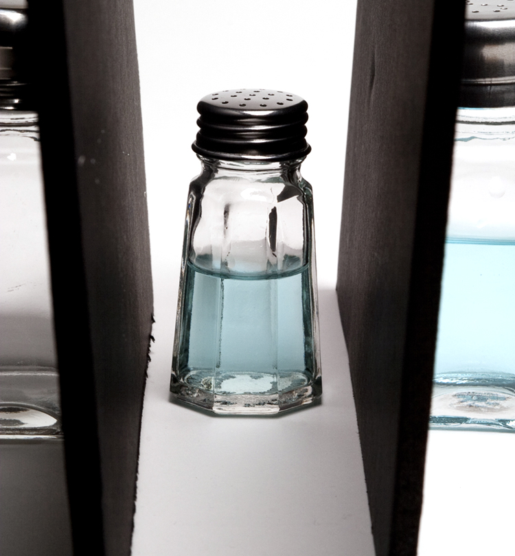
In order to create the notion of seawater, we coloured water with food colouring (even real seawater doesn’t look like much). The selected saltshaker was classic, neutral and free of any design details. Shooting glass is an interesting job. The reflections are the revelation to the craftsman’s skill. Anything shows up in the reflections. In order to create a strong bold image that would ultimately translate well into an icon (ie. brandmark) that could be used in many applications, we had to build up the edges of the image with strong black in order to define its shape. This was done by utilizing black studio card, pulled in nice and tight, to reflect black and create the strong definition. Otherwise, the light blows out the subject, and you get a lot of white, so the form breaks down. Lighting was an overhead soft box placed and feathered to get even exposure from left to right sides.
After the basic image was shot and we were satisfied, the image went through the retouching process: squaring off the shape, creating perfect symmetry, removing, imperfections, colouring and shadowing. Like sculpture or painting, the design/photography process is one of initial concept – then a pushing and pulling of creative techniques to mold the product into a final piece that best captures the initial idea and spark. Here’s the final brand mark below.